One piece of her work that I really like is called 'Between here and there' which created in 2009 consists of her putting birds into individual bags and photographing the movement. At first I didn't like the idea of the birds being confined into a bag and then photographing the struggle of them trying to get free, But at the end of her work she writes what exactly happened and what the images were trying to show. The birds were part of the National Nature Conservation and were waiting to have their identification tags attached to their legs, so while they were waiting she was able to photograph them, as soon as this had happened they were then released into the wild again, and none of the birds were harmed. The idea of this project was to show the movement and how fragile the birds are.
Monday, 23 April 2012
Jill Cole - Guest Lecture
Today, Wednesday 18th January we had a Guest Lecture, Jill Cole who is a Documentary Photographer and artist. In her work she uses the environmental issues that occur on a day to day basis and portrays that within her work. Not only is she an Artist and Photographer but she participates and conducts her own lectures in order to show others how her wok is influenced. During her lecture she talked about her current project she is doing, in which she uses a layering technique where she takes a number of photos and layers them on top of one another and bring pieces of each image through to the top layer giving off really interesting effects. I like the way she wants to show the different layers of the forest by using this technique.
One piece of her work that I really like is called 'Between here and there' which created in 2009 consists of her putting birds into individual bags and photographing the movement. At first I didn't like the idea of the birds being confined into a bag and then photographing the struggle of them trying to get free, But at the end of her work she writes what exactly happened and what the images were trying to show. The birds were part of the National Nature Conservation and were waiting to have their identification tags attached to their legs, so while they were waiting she was able to photograph them, as soon as this had happened they were then released into the wild again, and none of the birds were harmed. The idea of this project was to show the movement and how fragile the birds are.
Monday, 27 February 2012
Hayward Gallery - London Visit
On the 17th November we went on a trip to London to visit 3 different Galleries Somerset House, The National Portrait Gallery and the Hayward Gallery. Each Gallery was completely different, with both the type of work and the was that it was exhibited. The Hayward Gallery contained two types of work, one half of the Gallery was by the artist George Condo, his work was in an animated style and was quite strange. The other piece of work in the Gallery was by Pipilotti Rist, this was very interesting in the ways that this work had been produced and shown. The National Portrait Gallery hels the Taylor Wessing Portrait Prize which consisted of different types of portraits by a number of artists, there was a range of varitey with each portrait and they were very interesting. And finally Somerset House exhibited '20 years of the dazed and confused' Magazine, this was really interesting and had a wide range of interesting Fashion Photography.
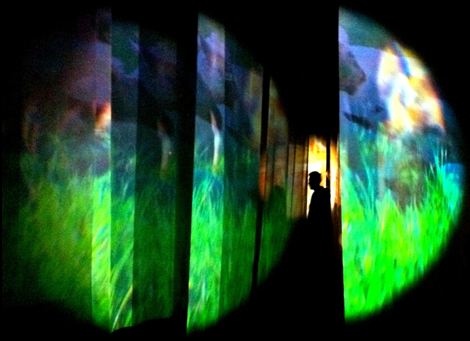
My favourite exhibition that we visited was the Pipilotti Rist in the Hayward Gallery, the exhibition consisted of sculptures, videos and other pieces of Artwork that showed her career from when it began in the 1980's to the present day. The exhibition is named ' Eyeball Massage'. The exhibition itself is very energetic, although has a calming and relaxed feeling to it, in the way it has soothing music and flowing movement within the videos exhibited.
Throughout the exhibition there were so many different videos and each one was shown in its own special way, especially ones that weren't shown too obviously on a big screen, some were placed in small holes in the floor so you really had to look into it, others were projected onto material that was suspended from the ceiling. My favourite part of the exhibition is the way in which she allows the audience to be incorporated within her work, as it allows a personal connection between the viewer and the work, the audience do not then feel rushed, they can walk around at their own pace. I feel that the atmosphere in the exhibition was very relaxed and calming, it took you into a world of peace and quietness. I think this was due to the soothing noises and ambient lighting, together with the soft flowing movement of the videos, none of the videos were showing aggressive or harsh movements. Combining this peaceful sound such as trees blowing in the light breeze made the exhibition more interesting as it made you feel you were personally in the videos.
I really enjoyed this exhibition, I found the ways the videos were shown very interesting and unique. Even though they are not really photography related and more video, I still like the attitude that it portrays, I think it works better with video than it would have perhaps with photography, due to the fact that you are able to see the flowing movements. This is an exhibition I would definately visit again in the future and I think it is a technique definately keep in mind for the future.
The Invention Of Photography
A photograph is created by light falling onto a light sensitive surface usually by using film or digitally, most are to be created by using a camera and by using the lens to focus the visible wavelength of light that is also visible to the human eye. The term 'Photograph' was coined by Sir John Herschel in 1839 and is based on the Greek term 'Phos' meaning light and 'Graphe' meaning drawing.
The first black and white photograph was made in 1822 by French inventor Joseph Nicephore Niepce built on a discovery by Johann Heinrich Schultz that silver mixture darkens under exposure to light.
The process of this technique was refined by Louis Daguerre, he found that by firstly exposing the silver to the Iodine vapour, before exposure then to the mercury vapour which was heated to 75 Celsius and exposed them to light for several minutes, after the photograph was taken the image was then 'Fixed' in salt water. This is what then led to the famous Daguerreotype. Most of his work consisted of portraits as they were thought to be more rare and sought after, this process took several minutes and differed from his pictures of the streets in Paris which showed no human activity or and people in the street, this was not because he didn't photograph any people, due to there being a long exposure with movement the people became invisible, this was when the faster lens' were introduced for portraiture.
In the 1840s the first attempts of colour photography was tested. Early results were encouraged by obtaining a solar spectrum by projecting it onto a surface, this proved to be successful, but the dim image found in the camera required an exposure for hours even days. Over the next 70 years or so, experiments increased and raised hopes making nothing of practical value. The 'Three Colour Method' was first suggested in 1855 by Scottish Physicist James Clerk Maxwell.
In the late 1981, Sony invented the first electronic camera called the 'Sony Mavica' This was a new camera that didn't have a film to work and was the first commercial electronic camera. After images were taken on the camera they were then put onto a television monitor or colour printer to be viewed. Event though this was technically the first electronic camera to be made, it is not considered to be a true digital camera, it was just the start. Since the 1970's Kodak had invented a number of sensors that converted light into pictures, until Kodak then came up with the worlds first mega pixel sensor that produced 1.4 million pixels and was capable of recording a 5 x 7 inch quality print.
This is the Sony Mavica, which was the first electric commercial cameras.
Tuesday, 1 November 2011
inspired by William Eggleston
After watching the William Eggleton video documentary 'The colourful Mr Eggleston' I found out a lt about his past and what type of work he does and the in which he uses his photos to show how colour has changed throughout the years, this is shown in the video when people only thought that good, professional pictures are to be in black and white. This is when William Eggleston introduced colour photographs in order to get people to appreciate and understand that colour photographs, after Eggleston introduced this people didn't like his work as they thought that it looked 'Unprofessional'. Most of his work is of normal, everday objects that we don't neccassarily pay attention to, but after he has photographed these it shows that you can get a good picture from such simple objects. Also he crestes portraits which are not like the normal pictures you would think when someone mentions 'Portraits' He doesn't construct his people, he take them discreetly without the person knowing, this makes his work even more unique and creates a mysterious feel to them.
For this task we were to produce a number of four photos which were inspired by the work of William Eggleston which we had to base on either composition, colour or theme. I instantly had an idea for colour, due to it being the middle of Autumn there are many magnificant colours on the trees and bushes outside. I think that this could show that coloured pictures are important as you wouldn't get the full effect of all the different colours if it was in black and white. I also thought that these would relate to Egglestons work as they are just normal objects that people see everyday but don't neccassarily pay that much attention too, then once photo it draws people into it.
I think these images are really effective in showing the importance of coloured images as you can see the contrasting tones of the leaves and it really shows off how beautiful the season is, which would be near impossible if they were in black and white. Also as mentioned briefly above, these normal everyday objects are not what people pay attention to on a day to day basis. I also like how the images are natural like many of his photos, none of them look as if they have been set up and they have just been randomly shot.
I do really like how my images have turned out and I think that they represent the colour theme well as there is a lot of contrasting colours. I also like how each picture varies in tone, with some of them being a more reddy colour and others more sublt oranges and browns. All of the photographs I think are good quality and it also shows clearly the detail of the leaves. I also think the way that I have related it to the season, Autumn now. I tohught that it was a good chance to capture some really fasinating colours, and it shows the importance of coloured photographs to capture object like this.
I thought that this task was quite difficult in itself as its quite hard to do as I think that having to have your work inspired by other makes you think aboiut what you have to do more.I think by having the specific guidelines it made it a more set task and harder to gather ideas, although I think that these were good areas to focus on because once you had a brief idea what you were going to do you could expand it and get some good images. As Autumn is probably my favourite season I really enjoyed going out and getting the pictures and seeing all of the different colours.
Tuesday, 18 October 2011
Fantasy Lanscape
Creating a 'Fantasy Landscape' was both fun while being quite challenging at the same time. When you think of fantasy, ideas come to your mind such as unicorns, rainbows and everything pretty and perfect. I had lots of ideas for what I wanted to do with my fantasy landscape, but obviously having to take my pictures within Burton, I was limited to what I could do with my picture. Although this was a tricky task I was still able to stick with my initial idea after looking at work of John Goto, where he has objects put in places that wouldn't usually be seen, for example a tree situated in the middle of water. This is where my idea for my image came from so going out into Burton I had a good idea of what to photograph.
Firstly I took a photo of a piece of land without any buildings, just a few trees and ducks wandering about, generally a place where buildings wouldn't be. I thought this would look good as a background for my image, I took a few snaps of locations similar to this before finally deciding which one I prefered. After this I was looking for a building to place onto the background landscape, I took pictures of pubs, churches and a few other buildings I thought might look good. I also took a number of photos of trees, plants and other natural things just incase I decided to add anything else onto the landscape.
Once I was back on the computer I uploaded my images and look through them before deciding which ones to work with, because our Landscape photos were to look professional I edited all of my photos on photoshop. Firstly I chose which background landscape I was going to use. The reason why I chose the one I did was because I thought that it looked like a place where you wouldn't find anything but the beauty of nature such as trees and ducks in the background. After deciding the background I chose to add a pub building into the image as it would look very random being in such a country like place. I started editing these images on photoshop by firstly uploading the picture of the background, and then of the pub. I then cut around the building of the pub by using the magnetic lasso tool carefully. I then duplicated the background layer, and dragged my cut out pub photo onto the duplicated layer and positioned it where I wanted it to be placed, as well as adjusting the size to make the proportions with the background look better. Then by using the eraser tool I rubbed out the rough edges around the pub.
After doing this I added a bush onto the landscape and went throught the same process as the buiding.
I am quite pleased with how this landscape has turned out, I really like how different and random it is, as it is in a place where you wouln't really find a pub, whereas I think the bush looks more realistic and it looks as if another object hasn't been placed onto the background, I think that in comparison to John Gottos work it shows well how unrealistic the photo looks, which links my work to his.
This is an example of John Gottos work which shows how unrealistic his work is. The top image though, could be resembling a real life setting by showing the number if people outside of McDonalds whereas the one below doesn't look right, it looks like a type of fantasy landscape which is shown in my own.
http://www.egglestontrust.com/
Firstly I took a photo of a piece of land without any buildings, just a few trees and ducks wandering about, generally a place where buildings wouldn't be. I thought this would look good as a background for my image, I took a few snaps of locations similar to this before finally deciding which one I prefered. After this I was looking for a building to place onto the background landscape, I took pictures of pubs, churches and a few other buildings I thought might look good. I also took a number of photos of trees, plants and other natural things just incase I decided to add anything else onto the landscape.
Once I was back on the computer I uploaded my images and look through them before deciding which ones to work with, because our Landscape photos were to look professional I edited all of my photos on photoshop. Firstly I chose which background landscape I was going to use. The reason why I chose the one I did was because I thought that it looked like a place where you wouldn't find anything but the beauty of nature such as trees and ducks in the background. After deciding the background I chose to add a pub building into the image as it would look very random being in such a country like place. I started editing these images on photoshop by firstly uploading the picture of the background, and then of the pub. I then cut around the building of the pub by using the magnetic lasso tool carefully. I then duplicated the background layer, and dragged my cut out pub photo onto the duplicated layer and positioned it where I wanted it to be placed, as well as adjusting the size to make the proportions with the background look better. Then by using the eraser tool I rubbed out the rough edges around the pub.
After doing this I added a bush onto the landscape and went throught the same process as the buiding.
I am quite pleased with how this landscape has turned out, I really like how different and random it is, as it is in a place where you wouln't really find a pub, whereas I think the bush looks more realistic and it looks as if another object hasn't been placed onto the background, I think that in comparison to John Gottos work it shows well how unrealistic the photo looks, which links my work to his.
This is an example of John Gottos work which shows how unrealistic his work is. The top image though, could be resembling a real life setting by showing the number if people outside of McDonalds whereas the one below doesn't look right, it looks like a type of fantasy landscape which is shown in my own.
http://www.egglestontrust.com/
Guest Lecture - Artists from Snibston
On Wednesday 28th September we had a Guest Lecturer come in to talk to us about the new project that has been set up at Snibston. The lecturers were a group of different types of artists. They came in to tell us about the new project that has been set up which is aimed to tell the stories from the past on the mining in Snibston, they do this by using different types of artistic techniques. The Artists who participate in the project are Peter Walker and Andy McKeown. The way in which they use their artistic skills is very unique and different to projects that have been done before.
In this project they ask visitors an volunteers at Snibston to to take photographs that they can then use to put onto the special software called 'Slipstream' This software allows you to upload images onto it and cut them down into different shapes, they are then randomly shown digitally on large buildings creating continuous images that change to show the history of Snibston mining, sound is also used. These can be then displayed onto the builidings within Snibston and surrounding areas.
I really like this new way of showing images, Its different from the usual and just placing photographs in frames and presented on a wall. I also like how the pictures are randomly shown and put on buildings, this is unique and effective in a way in which people will remember it as it is different and will get peoples attention. I think that is is good that they are wanting to show the History of the mining to the public too.
I would consider using this software, as I think you can get some good effects and designs from it. I like the way you can show many things in a matter of minutes that may describe a story or show emotion. The only down side to this software is that you aren't able to save your work, this would be harder to show progress and you wouldn't be able to put it in your sketchbook. I would still download it nevertheless.
http://www.leics.gov.uk/transform.htm
In this project they ask visitors an volunteers at Snibston to to take photographs that they can then use to put onto the special software called 'Slipstream' This software allows you to upload images onto it and cut them down into different shapes, they are then randomly shown digitally on large buildings creating continuous images that change to show the history of Snibston mining, sound is also used. These can be then displayed onto the builidings within Snibston and surrounding areas.
I really like this new way of showing images, Its different from the usual and just placing photographs in frames and presented on a wall. I also like how the pictures are randomly shown and put on buildings, this is unique and effective in a way in which people will remember it as it is different and will get peoples attention. I think that is is good that they are wanting to show the History of the mining to the public too.
I would consider using this software, as I think you can get some good effects and designs from it. I like the way you can show many things in a matter of minutes that may describe a story or show emotion. The only down side to this software is that you aren't able to save your work, this would be harder to show progress and you wouldn't be able to put it in your sketchbook. I would still download it nevertheless.
http://www.leics.gov.uk/transform.htm
Wednesday, 14 September 2011
Summery things :)
To show what I did over the summer I was to take pictures that related or showed what I had been up too. The things that I did were
* Going to London a number of times.
* Trips to Bicester.
* Saw Take That at Wembley Stadium.
* Went on numerous shopping trips to Nottingham.
* Went into town partying.
* Went on trips to the cinema to see The Inbetweeners, Final destination 5 and Harry Potter
* I went on some University open days to Derby and Nottingham Trent.
* I also went to look at some horses. And also helping a friend with her ponies.
This is a picture to show that I went to lots of different places with family such as Chatsworth. Also my other photos I think show what I have done over the summer quite well, as I have a number of different types of photos. Some of these are photographs of cafe signs which show I was out a lot. I also like how they show that I have been out walking in the countryside.
This is my edited image. I chose to edit it because I think that it resembles well what I did in the summer which consisted of going out for day trips to places. Also I have been out horse riding in the countryside so I think that the green colours made it look right. I decided to put the black and white layer over the top of the original layer, I then rubbed out the areas I wanted to show through and stand out. I think it worked well as you can define the leaves and bright colours.
* I went on some University open days to Derby and Nottingham Trent.
* I also went to look at some horses. And also helping a friend with her ponies.
This is a picture to show that I went to lots of different places with family such as Chatsworth. Also my other photos I think show what I have done over the summer quite well, as I have a number of different types of photos. Some of these are photographs of cafe signs which show I was out a lot. I also like how they show that I have been out walking in the countryside.
This is my edited image. I chose to edit it because I think that it resembles well what I did in the summer which consisted of going out for day trips to places. Also I have been out horse riding in the countryside so I think that the green colours made it look right. I decided to put the black and white layer over the top of the original layer, I then rubbed out the areas I wanted to show through and stand out. I think it worked well as you can define the leaves and bright colours.
Subscribe to:
Posts (Atom)